AEROTROPICAL is a small #WIP project we are running at the moment. It’s just an idea we like and myself and Ryo came up with it after we both saw the latest season of NARCOS.

If you remember, the planes bought by the cartels were from a defunct airline called AEROTROPICAL. With a bit of research, it was clear the URL was available so we couldn’t help ourselves, we had to have it. Go check out our new AEROTROPICAL landing page.
FIRST THINGS FIRST: BACKSTORY
AEROTROPICAL was a real airline. It was no worldwide name in the aviation industry, it was a small airline based in Angola which existed for about 3 years. It sadly shut after an accident where 8 people were killed.
According to the Encyclopedia of African Airlines, Aero Tropical operated domestic and regional cargo flights to Benguela, Cabinda, Kuito, Luanda, Luena, Menongue, Namibe, and N’Giva. The Fleet consists of one Antonove An-12 and one An-32B.
This is where for us reality meets fiction – or not!
Was it the AEROTROPICAL fleet the NARCOS bought? Who did the paint job and the livery for the show. This is all something we’ll get our researchers to work on as the project moves forward.

NOW TO BRANDING!
Branding is a difficult topic. It’s about perception, meaning and it’s a very difficult concept to nail down. I read that The Dictionary Of Brand defines a brand as a ‘perception of a product, service, experience’ and I believe the word perception is probably the most key point here. In a previous role, I saw so many people perceive their brand in certain ways and were quite often stuck in quite rigid systems of thought. Ways of how their brand looked and what they felt it meant, were all based on their own biased perceptions. They were also very passionate about their business and ideas, so much so they would forget about their users and audience members.
So from meaning different things to different people at different times to agreeing a shared vibe and understanding of a brand, it’s a difficult subject to nail.
And for this project, we’re starting in a semi fictional world which is great but also problematic.
DISCLAIMER
I should really put a disclaimer in – we are not branding experts. Not by a long shot. We have experience in building our own brands like STICKERBOMB, SOIMUSICTV and our latest offering CUTPACKS. We have had some success and some failings but all the way we’ve had some great colleagues, mentors and friends who work as specialist branding experts who we turn to in times of brand identity crisis.
WHAT DO WE KNOW AS FILMMAKERS AND CREATIVES?
More than we thought. When we make our title sequences for our films or even graphics for a job we’re on, it’s an opportunity to stamp the identity of the piece and communicate even more to the audience. The NARCOS title sequence, throughout all the series, does so well in building the world you are about to enter. We’ve tried to do the same through a variety of title sequences we’ve made for our work and we’d like to do that with AEROTROPICAL.
THE AIRLINE INDUSTRY
When it comes to branding AEROTROPICAL, we are finding this challenge to be very difficult and this project will remain and always be a work in progress. Branding is not just about logos or just about colours. It’s a lot more. It is about feelings and perceptions.
Airline logos are so similar and colours are so samey with a lot of blue and red to reassert traditional values. From blue you get that trustworthiness and red gives you that bold strength. For us we want to make AEROTROPICAL stand out.
As we’re a defunct, semi-fictional airline, we don’t have competition. We already lost or it never existed, but thanks to the NARCOS tv series, we consider ourselves a luxury airline with our customers being stylish suave, tropical guys and girls.
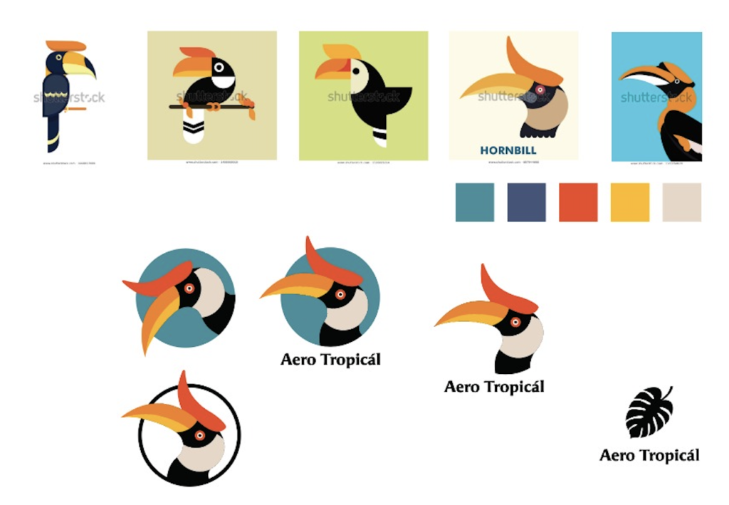
AEROTROPICAL
So here is where we are at. After a few conversations, Ryo put some ideas down that he’s not happy with (which you can see below). It is based on trying to develop what is there. The tropical vibe and the iconography around it. But already we are both not happy with the vector clean line styles.
So it’s back to the drawing board as we clearly need to do some more research. We need more imagery, more inspiration and build out a better mood board. That combined with a better backstory and a good set of rules and parameters for us to follow, we should have something to show you all very soon.
If you need some design or creative input or you are looking for some creatives to collaborate with, book a free consultancy with us over here.